Final Product
The Solution
Why
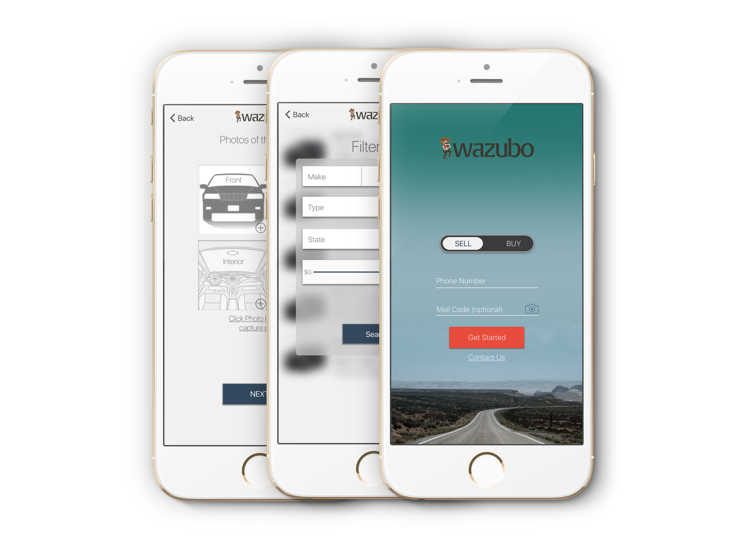
I designed a iOS application where users can submit directly submit their application and receive a refinancing offer in real-time. The users are able to fill-in their vehicle information and take pictures of vehicle in app.
Wazubo was created because Robert Morris was moving their advertising efforts from paper to digital. They wanted to cut down data entry and improve the efficiency of their processes.
Process
User Research & Persona
I met with the CEO of Robert Morris for a kick-off meeting. There I discovered his goals, why he wanted to move to a digital platform, and functionality and requirements of the iOS application. He only provide me this to work with: THE LOGO


We then dove deep into his customers database. Sorting through countless excel sheets, we discovered that most of his customers were located in the heart of middle america, mostly hard-working class americans. We also wanted to see who "Wazubo" ideal users would be. How old would they be? Where do they live? What jobs did they have? What were their shopping and spending habits? Taking both very valuable information we blended it to form our ideal user persona.
Application Wireframing & Prototyping
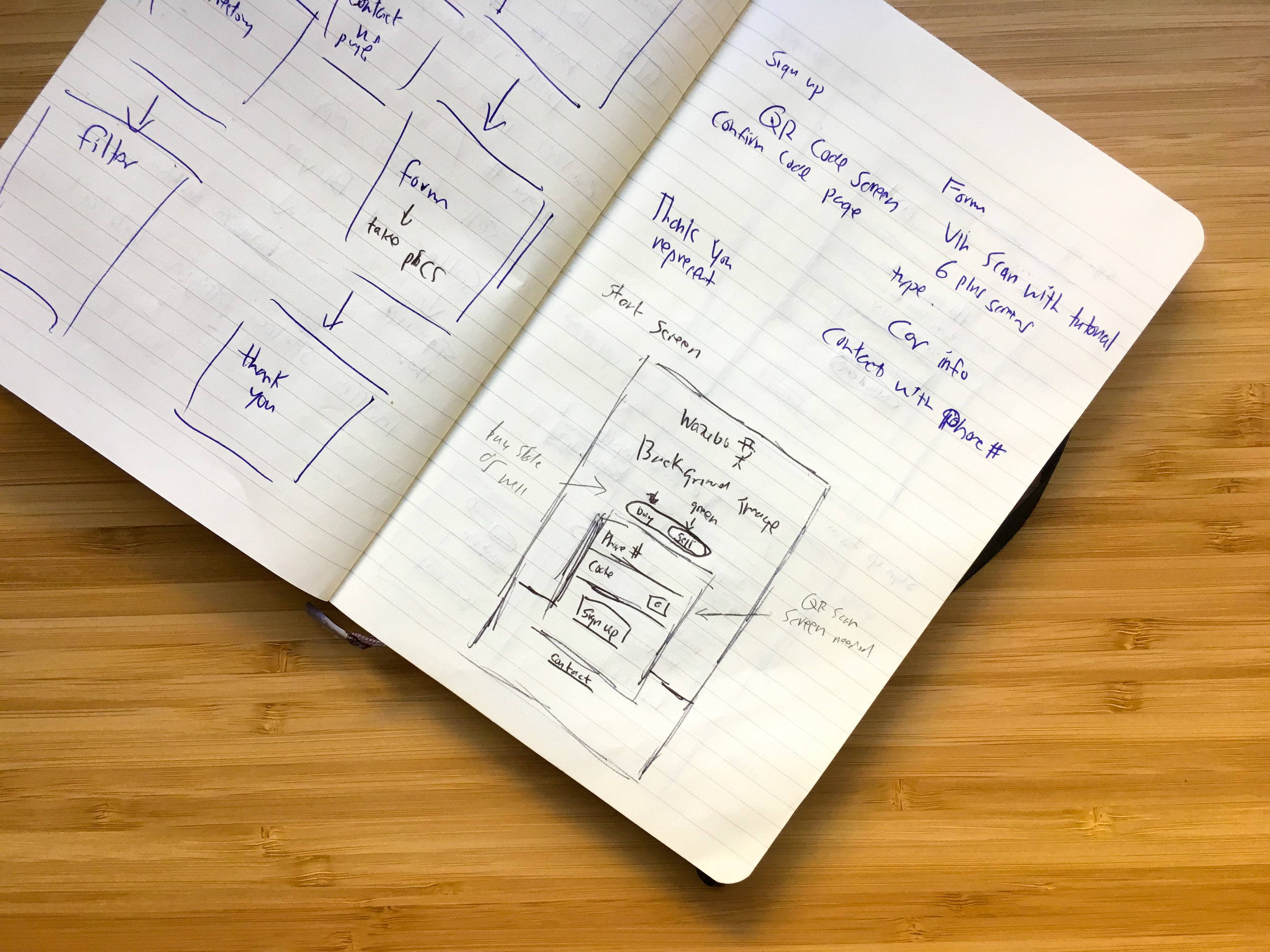
We sketched out our initial ideas on paper, building our low-fi prototype and working out screen flows. We started with paper because how easy it is to visualize good ideas and bad ones.
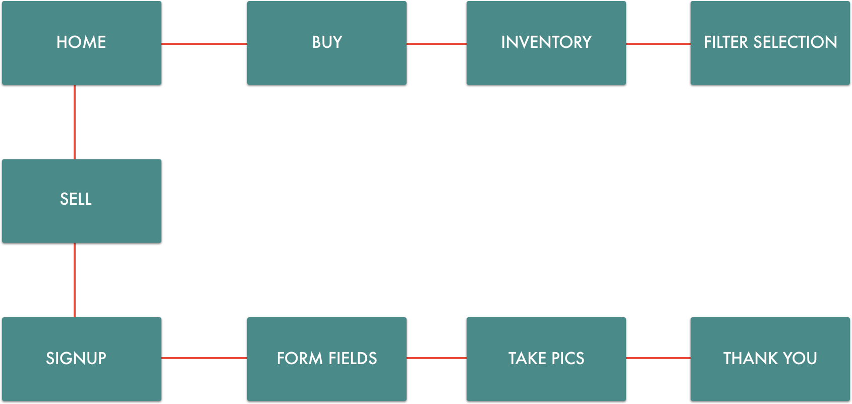
Then breaking down the requirements of the application and then creating a site map.
-
Photograph Uploads
-
Buy Directory
-
Filter Feature
-
VIN Scanner
-
Login Page utilizing QR code reader
-
Sign up Confirmation
-
Vehicle Information For
-
Contact Me Page
Initial Sketches & Notes
Site Map

Iteration 1
Our first iteration of the application was good but not great. While designing the initial draft of Wazubo, we took the branding colors of greenish teal and pink and incorporated it into the application. We weren't sold on the colors, after showing it around the office, we all agreed that the green and pink were too dramatic. Now back to the drawing board.
Many Iterations Later
After a few different iterations, it settled into to a light blue gradient for our sign up screen and minimal coloring for the rest of the application. We decided against the pink because it garnered too much attention and then eventually took away the teal because we couldn't find colors that complemented the application well. We also discoverd that such bright and unorthodox colors turned our primary users, 40-50 year olds, away from the service. The new navy blue would work better for our application, instilling a sense of trust and reliability.
Software Used: Sketch, Invision, Zeplin, Photoshop, Keynote(Animations)
Noteable Screens


No comments.